 Chevrons have become the latest new look in safety markings on emergency vehicles. Regardless of whether you love chevrons or hate them, the inverted-V markings will be displayed on even more Police, Fire and Ambulance vehicles every day. The numbers will increase regardless of the results found in any investigative studies. Chevrons will continue to be fitted to vehicles and this will be due more to popularity than the presence of reliable research.
The key question: Is the use of chevrons effective and good practise?
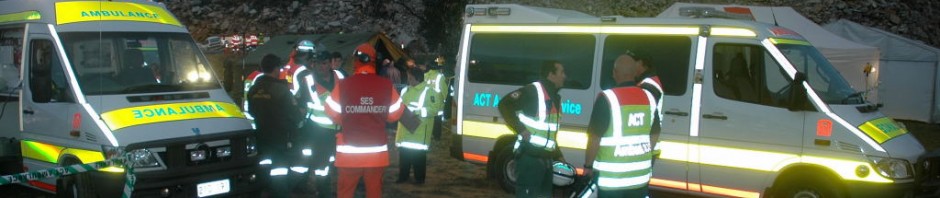
Chevrons have been affixed to UK Police vehicles since the early 1990’s. They were officially adopted as an element of the Battenburg design which was researched and designed in the UK by The Home Office. Most of the Battenburg research was focussed on the contrasting squares displayed along the vehicle sides – the extra yellow & red chevrons were then literally tacked onto the backend of the chequered design. After the UK Police adopted Battenburg, the markings were later embraced by the ambulance and some fire services in Britain. The last decade has seen selected emergency service agencies throughout the world slowly begin to introduce chevrons on their fleets. These posts will hopefully offer some clarity about chevrons and aid in making an informed choice about fitting them to fleet vehicles.
In January 2009 the United States NFPA 1901 (National Fire Protection Association) voluntary standard recommended all new fire apparatus to have at least 50% of the rear of the truck covered with six-inch red/yellow alternating stripes in a chevron (inverted V) pattern. This initiative was introduced to increase visibility and reduce the number of rear end collisions with fire appliances. A flow-on effect to ambulances has taken place due to both publicity and the large number of joint Fire/EMS agencies across the country. Later in August 2009 the Federal Emergency Management Agency (FEMA) released the Emergency Vehicle Visibility and Conspicuity Study which commented on chevrons, but the report did not directly support their use. There is now a cascade of current and new vehicles in the US being fitted with chevrons as a visual safety device.
This five part series will present and discuss the following issues about chevron markings:
Part 1
- Origins and traditions of chevrons
- Different types
- Interpretation of the chevron pattern
- LBFTS accidents and chevrons
- Available research
Part 2
- Chevrons on current & future vehicle fleets
- Differing expectations of Police, Fire & Ambulance
- Current fleet markings with chevrons on different vehicle styles
- Battenburg and chevron markings
- Chevron colour
Part 3
- Dazzle, confusion and camouflage
- Chevrons – Urban vs Rural
- Viewing distances
- Depth perception and rate of closure
- Text over chevrons
- Front, side and bumper chevrons
- Doors, hatches & lockers
- Scene blocking – inline and echelon parking
- Chevron coverage and cost
Part 4
- NFPA and FEMA recommendations
- Chevron stripe widths, number and angle
- Full or half coverage
- Reflective Materials
- Chevron colours
Part 5
- Case studies
- Additional studies and research
- Reference material
Chevrons – Part 1
The chevron pattern occurs in nature, generally as camouflage markings on fish or seen in the migratory formations of birds. Humans began to draw chevrons as decorative patterns in early art such as cave drawings and pottery. The patterns were later adapted for use in heraldic crests and shields. Modern day usage includes military and civil insignia, corporate logos, road signs and distance markings. Many different chevron designs have been displayed over the years as safety patterns on vehicles and this usage has increased dramatically over the last forty years.
The V shape of chevrons can be aligned in any direction and each orientation has a different meaning depending on the intended message. On highway, traffic and vehicle signage the chevron can have multiple meanings. Painted as markings on the road chevrons are used to time the safe distance between vehicles. Chevrons have been, and still are, used to delineate curves, corners, intersections and obstructions as warning signs on the roadside. Chevrons used for early road signs were coloured black on a yellow background. While the red/yellow colours are now the most popular colour combination, chevrons can be displayed in many other colours although these may not be as effective as the red/yellow pairing. Queensland Transport in Australia has printed A Guide to Hazard Markers showing how to interpret the chevron pattern displayed in different shapes, sizes and orientations.
The problems of correct interpretation with the chevron design have been outlined in the previous paragraph. Considerable discussion has taken place over the last few years on two notable issues: First,the chevron patterns used on emergency vehicles show that traffic can pass on either side of the emergency vehicle; but this may not be the case at an accident scene or when the vehicle is positioned in the blocking mode. Second, chevron designs have typically marked fixed road obstructions using a sign that does not move around – now the chevron pattern is being transferred to moving vehicles that can also stop still in the middle of the road. This change of methodology appears to blur the very nature and impact of the original warning sign which every driver learns from day one!
Looking at the first issue – the chevron design indicating it is safe to pass alongside; this may be a valid point if every driver knew the finer points of chevron layouts (see the link to the Hazard Marker Guide mentioned earlier). The reality is that most people don’t know and don’t recognise the individual variations. They will realise that the chevron is attached to an emergency vehicle and in general, drive reasonably according directions given at the incident scene in front of them. Some may not, but the chevron design probably won’t be the specific cause of this failure.
The second point about displaying chevrons on moving vehicles is more ominous. Even though the pattern has been borrowed from stationary signage, emergency vehicles can be travelling at any speed, stopped in blocking mode or just parked at the roadside. Drivers will progressively learn that chevrons are no longer stationary, the design now hitching a ride on the back of vehicles. The danger here lies not in the transition from stationary sign to moving vehicle and then to a stopped vehicle, but in the probability that drivers may not realise that the emergency vehicle has in fact stopped, especially when parked in-line with traffic flow. This confusing effect is not limited to the chevron patterns, however chevrons are usually fitted to emergency vehicles in an effort to reduce or prevent rear-end collisions. The chevron pattern may reduce the ability of following drivers to judge closure rates – more on this point in later posts.
Increasing rear-end safety was the prime reason for including chevrons in the Battenburg specification for vehicle markings. There are several interesting points to make about the chevron and Battenburg combination. Red & white chevrons had already been placed on UK police cars as an early response to an increasing number of rear-end collisions with police vehicles, especially on motorways. When the Battenburg livery was under development, the inverted V yellow and red pattern on the rear was added to the design. The research papers written about Battenburg make no reference to any separate testing of the chevrons, changes in the rear-end accident rate or reference to any other research indicating chevron effectiveness, just that the colour was selected for maximum conspicuity in-line with existing chevron road markings.
Three well-respected researchers, Green, Hole and Langham, having written independent reports on physical and cognitive visibility stated that despite chevrons being fitted to British police cars, the rate of rear-end collisions continued to rise. All three explain that the increasing accident rate is proof that physical conspicuity alone does not diminish accident rates. The fact is that cognitive functions play a large part as well. The two types of visibility are described by Langham as:
- Physical Visibility – The most physically conspicuous objects possess the ability to capture the attention of the observer over and above other parts of the visual scene. Engel (1977) described physical conspicuity as the detection of a target in a brief presentation.
- Cognitive visibility – Not only does an object such as a maintenance or works vehicle need to be ‘seen’, it needs to be ‘recognised’ for what it is – an increased risk and potential hazard. This is a concept known as cognitive conspicuity and relates to expectation in perception and can explain why, for example, a driver can look straight at a cyclist or motorcyclist and then drive straight into them….
Cognitive perception & information processing by drivers seems to play a major part in Looked but Failed to See accidents (LBFTS). In his book The Psychology of Driving (p55), Graham Hole refers to the study An analysis of “looked but failed to see” accidents involving parked police cars (2002) undertaken by himself, Langham, Edwards & O’Neil. The study investigates LBFTS accidents involving other cars with police vehicles. The research found that many of the accidents occurred in good weather with a prolonged view of the stationary police car. The drivers were sober and the accidents occurred at no predictable time throughout the day.
During follow-up photo simulations in the laboratory, police cars with side/rear markings and flashing warning lights were shown protruding onto the motorway and parked inline or at an angle to the traffic flow. These scenarios were then tested for driver response. The results showed that the vehicle parked at an angle to traffic encouraged a faster reaction time than the vehicle parked in-line with the traffic flow. When some participants in a second trial were distracted with a mobile phone task they either failed to respond to the hazard or had a virtual collision with the police car.
These trials indicate five important points:
- Highly conspicuous vehicles may not always be physically seen by drivers, especially if the driver is distracted.
- Drivers may see the conspicuous vehicle but then fail to process the information quickly or not at all, thereby narrowly missing or crashing into the police vehicle.
- Stationary vehicles parked in-line with the traffic flow may be seen, but if the vehicle pops up suddenly and is not expected then it may be perceived to be another moving vehicle until it is too late to stop and then a collision occurs. If the warning lights are flashing the viewer may also believe that active lighting indicates the vehicle is running to an incident and will not expect the police vehicle to be stopped on the road.
- Emergency vehicles should be parked at an angle to the traffic flow so the unusual position clearly indicates to approaching drivers that a parked vehicle is ahead. The position of the car (either marked or unmarked) is usually an abnormal situation. This parking technique has been called echalon parking.
- Driving is often monotonous and drivers may not visually scan the changing conditions continuously, but at intervals. Periodic scans may not detect the radial expansion in the visual field of a parked emergency vehicle until it is too late. If periodic scanning and fatigue are combined with a lack of expectation the combination may result in a collision.
So where does this leave the chevron position at the end of Part 1? Chevrons remain controversial with very little research or information available. The major experience with chevrons comes from the UK emergency services. Little follow-up research has been undertaken to assess chevrons or the Battenburg design. The UK Police study has shown that rear-end accident still occur after chevrons have been fitted to vehicles and when a driver is distracted the presence of lack of conspicuity markings makes little difference. There are still visibility studies relating to chevrons and they will be included within the next few posts. Please post any comments if you wish to raise a few issues or add some extra information.
Over the next week I hope to publish an extensive list of reference and associated documents relating to chevrons. Part 2 will be posted early next week and look at the following issues:
- Chevrons on current & future vehicle fleets
- Differing expectations of Police, Fire & Ambulance
- Current fleet markings with chevrons on different vehicle styles
- Battenburg and chevron markings
- Chevron colour
See you then!


Pingback: Chevron markings on Emergency Vehicles – the blog series | Ambulance Visibility Blog
Pingback: Emergency vehicle chevrons – the AV Blog series Part 2 | Ambulance Visibility Blog
Sirs, could you please referance any problems with using a standard V pattern for the reflective chevron markings on the rear. Not the inverted V pattern. Our department has installed a V pattern on the rear of one of our larger trucks and have come under question as to why. Somewhere a while back I read that the standard V pattern draws you attention to the standing vehicle much better then an inverted V pattern. Can you explain. Thanking you in advance.
LikeLike
I too am researching chevron layout. I recently had an ambulance striped with the upright V chevron in red and white. I can find no information saying that chevrons in any orientation are even recommended for emergency vehicle visibility schemes. That being said it appears that the opinions are as varied as the individual emergency vehicle. Any further insights are much appreciated.
LikeLike
The mention of ‘looked but didn’t see’ accidents reminded me of a traffic researcher at University of NSW who was asked to design a warning light system for elevated platform power line repair trucks. The client expected some advice for a set of flashing lights, but Dr Fisher (the researcher) related to me that his advice was to put flood lights on the bottom of the elevated platform and illuminate the truck; much better for spatial recognition in his view than flashing lights. It didn’t get done, but interesting idea.
LikeLike