 Last week, I was at an intersection in Sydney waiting for a red light to change. Off to the left and without warning, a white blur appeared in the corner of my eye. It took several seconds to recognize what was happening but by then the motorcycle had weaved its way across two-thirds of the intersection. The bike sped out of view; a blue masthead lamp mounted on the rear of the bike flashed – just once. The motorcycle rider, a Police Officer, was responding to an emergency call. There was no wail of the siren to be heard inside my car, no other timely warning; more important, there was no obvious indication that the bike was an emergency vehicle.
The police motorcycle was engaged on a vital task; but painted bare white and travelling at high-speed it looked just like many other motorcycles found on the road (image at right). The blue chequered bands and the miniature police badges visually morphed into an indistinguishable blur. Small complex patterns can have the same effect – even turning some designs into camouflage (see image left below). Both the chequered and the miniature permutations of the Battenburg marking scheme are remarkably effective in breaking up the bike’s visual profile (especially when the bike is seen from the front). All this significantly increases the time taken by drivers to detect and recognise a motorcycle on response duty, thus reducing the valuable time they need to avoid the bike.
Furthermore, most motorcycles used by emergency services lack suitable mounting points for the warning lights; thus response motorcycles tend to display only a minimal number of lamps – often just a single masthead lamp plus several other smaller lights facing the front and rear. The police rider on this particular day was wearing a fluorescent vest (enhancing his conspicuity) but this vest had no distinguishing markings and was again identical to the vests worn by scores of other ordinary bike riders.
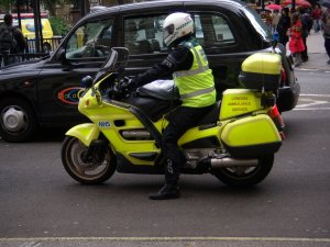
Compare the motorcycles described above with the London Ambulance Service (LAS) motorcycle in the photo at right. The LAS bike is painted one colour of yellow-green with retro-reflective fluorescent panels added to the body. The bike is visualised as a complete and recognisable object. The fluorescent panel markings “glow” in the light of dawn & dusk when thy are most needed. When the bike is seen from any angle the yellow-green colour clearly identifies the bike as an emergency response resource amongst other vehicles in traffic. There is no need for identification patterns and the small NHS and LAS labels are all that is required.
REMEMBER – The series on <<<Chevrons>>> starts Tuesday 1 June 2010


Pingback: Conspicuity for emergency motorcycles – Battenburg vs Fluorescent markings | Ambulance Visibility Blog
I know this post is years old, but remains an essential message. Yesterday I saw a NSW police motorcycle on urgent duty negotiating a T intersection. All went well from a safety point of view, and traffic response was fair to middling (traffic was moderate for the highway in question at Gordon, in Sydney). What could have improved though, is the conspicuity of the unit. The combination of rider attire and bike livery produced a wonderful camoflage of small guage broken patterns, that obscured the unit against the broken medium dark background of the sunny street (shadows=dark). The viewer had to work hard to identify the unit. I as a pedestrian had to work hard to get a clear focus on the unit!
Add to that the particular blue used (I think the lighter blue typically used in the USA is better), the disjunct between rider attire colours and shapes, and the invisibility of red warning lights to the hearer of a siren (the siren wasn’t that loud come to think of it, although I was about 90 degrees off axis). An old piece of Russian research that I read in Green’s 70s paper ‘Emergency Vehicle Warning Systems and Identification’ found that the perception of red is attenuated by an observer also hearing a loud sound!
I think the police in NSW have gotten carried away with the livery of their cars as ‘branding’ rather than conspicuity. For a car, maybe OK, but for a bike, where the safety issues for riders are acute, not good at all.
The rider and the bike must be presented as a single visual unit by uniform colouration, as you suggest.
LikeLike
Further to my post above, with the small size of motorcycles and their limited ability to carry overhead warning lights, perhaps safety would be improved with large diameter whilte lights directed laterally at the front of the bike and on a steady beam. This would create an instinctive impression on cross traffic of a vehicle heading towards them and get immediate attention and behaviour change, without the motorist having to ‘de-code’ the signal. So, instant response as traffic would be disuaded from advancing into the intersection.
LikeLike