Many earlier posts have described the problems associated with affixing a range of different patterned markings (especially rear chevrons) onto emergency vehicles. The problem is made even worse when a number of local agencies independently decide to display different pattern styles to brand their vehicles in an attempt to highlight their agency’s individuality. It is only when all the different vehicles pull-up alongside one another that the full impact of the pattern confusion becomes obvious.

Pattern markings conflict to induce camouflage effects at an accident scene
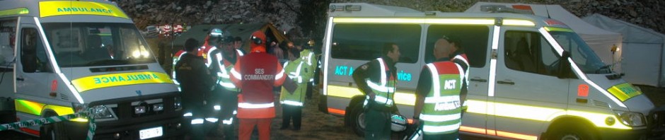
The image above image clearly demonstrates the conflict effects with a mixture of diagonal chevrons in red/white or yellow/red colours alongside the bands of blue and red chequers. The patterns are so strong that they continuously distract the observer by pulling and drawing the eye to different areas within the scene. This effect makes the outline and shape of each vehicle much harder to discern. Subsequently the observer’s ability to make sense of the scene is greatly reduced. The landscape background shown is plain but another more complex streetscape littered with cars, signs and buildings would visually complicate the entire scene even further.
The only stand-out elements are the plain yellow-green fluorescent arch on the rear of the fire appliance and the orange sill stripe on the ambulance, both of which reinforce the important visual strength of solid fluorescent coloured markings on vehicles. The image also demonstrates the weakness of red/white chevrons when compared to the universally accepted colour combination of red and yellow chevrons angled at forty five degrees.
Enough said for today……..try to stick to simple solid colour designs for vehicle markings and other drivers approaching an accident scene will appreciate your effort.


The lates Victorian marking changes lack solid lines and seem like after thoughts rather than a discernible highly visible design.
LikeLike
Ambulance Victoria vehicle markings have indeed turned into a very complex layout and colour mix.
LikeLike
nice information. appreciate.
LikeLike