Welcome back to Part 2 of the Chevron Blog. This part will discuss the following topics:
- Chevrons on current and future vehicle fleets
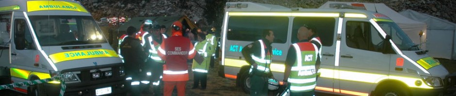
- Current fleet markings with chevrons on different vehicle styles
- Differing expectations of Police, Fire & Ambulance
- Battenburg and chevron markings
- Chevron colour
You may well ask; why all the fuss about fitting chevrons to vehicle fleet? This single basic aspect is often overlooked when the time comes to decide about appling chevrons to all the different vehicles in your fleet. In some cases the move to fit chevrons is a voluntary decision within one organisation. In other situations it may affect a complete industry; this was the case when the NFTA in the United States recommended all fire appliances be fitted with chevrons that cover at least 50% of the rear-facing profile.
This type of blanket requirement may have a few implications for some agencies but can present a difficult set of problems to others. In the case of the NFTA, the area of coverage was set at a minimum 50%, which was appropriate and allowed flexibility for the layout of the chevrons to fit different vehicles. If the coverage requirement had been set at 90%-100% then the recommendations would be impossible to implement by some fire departments because the unusual design of their vehicles would not allow the full coverage required.
The question of vehicle layout and suitability must be asked of all new marking designs, not just when fitting chevrons. When a complete redesign of the organisational markings is anticipated then all the vehicles, both current and future, must be evaluated for suitability and the visual fitness of the vehicle to receive the new markings. This assessment should include any four-wheel-drives, ATV’s, aircraft, boats, motorcycles, personal transport (eg Segway’s), electric buggies and bicycles that may be operated the agency. The shape and visual profile of all transportation used must be able to carry the markings in a common format; otherwise the unifying identity of the new marking design will become confusing to the public. All efforts should be made to anticipate the type & shape of vehicles that will be purchased in future years, especially where extensive fleet changeovers are likely or a change of manufacturer is a real possibility.
It is also important to recognise that some vehicles and aircraft have no operational need for chevrons. Sometimes the particular size & shape of vehicles means that chevrons just cannot be fitted. Personal transporters, bicycles and like vehicles move relatively slowly compared to cars and they usually do not need to be placed in a blocking position on a highway (like other emergency vehicles); as such, no chevrons are required. Sometimes the rear of the fire vehicle is asymmetrical with steps or closely spaced warning lights leaving little or no space for chevrons to be seen effectively. A flexible approach for national regulators is to provide either an exemption for different or unusual vehicles or allow for an alternative marking panel in a single colour (eg yellow, yellow/green or red) rather than the obligatory full chevron pattern.
A blanket chevron policy can be a real problem when governing organisations apply mandatory provisions for standardised markings nationwide. These problems increase even further when the national mandate conflicts with any existing federal, state or municipal regulations that cause the new markings to clash with existing statutory vehicle safety markings. The authorities in the UK had to petition parliament to change the road regulations so emergency vehicles could display the new Battenburg design and colours. One benefit of the legislation review was the changes effectively prevented any non-emergency entity from displaying similar colours on their vehicles. Unfortunately, imitations of Battenburg in permitted colours are creeping onto the roads
The compatibility of any new chevron design with existing vehicle markings is the always a major issue that needs to be addressed. Most emergency agencies value their corporate image and their agency vehicle marking scheme. However, it can be very tempting to change the colour of the chevrons to match the existing colours. There is also a common tendency to overlay large amounts of text information already displayed on the rear of the vehicle over the chevrons – you should resist both these urges and also minimise and limit the text so it is clearly legible!
The addition of standard yellow & red chevrons to a vehicle needs to be assessed carefully. Some vehicle colours and marking schemes (especially red & yellow body markings) may be disrupted when the chevron patterns are added, leading to great confusion as the camouflage effect begins to take over. Closely supervise any graphic designers who may attempt to promote “looks over function”.
Camouflage effects of red/yellow chevrons combined with Battenburg markings
The FEMA visibility report released last year was successful in illuminating a number of issues. The report investigators had to review the needs of the many different emergency agencies in the US and provide some generalised guidance. In doing so the report also recognised the major differences in the level of need for on-road conspicuity required by the three main emergency services: Police, Fire and Ambulance/EMS.
The Police require a stealth aspect for some operations but afterwards those same stealthy vehicles may require an increased level of conspicuity during different stages of the operational timeline. This is not an easy issue to resolve for law enforcement agencies. Ambulance/EMS and fire agencies always share a common need for maximum visibility and conspicuity throughout the course of their daily work. This is unlike the Police who often need a progressive scale of visibility levels. A dark coloured police sedan or black & white cruisers could be marked with chevrons or the word POLICE on the rear in a matching colour (black reflective on black or white reflective on white) that will be almost unseen in daylight but reflectively active at night under headlight illumination for traffic stops. Sometimes less than optimum safety markings can disguised as common stripes or decoration as a compromise.
The Battenburg marking scheme in the UK provided the opportunity and initial momentum for the adoption of rear-facing chevrons in other countries. This followed after the inverted-V chevron design was combined with the new harlequin block markings on police vehicles. The UK was the first country to standardise a high-visibility marking scheme following the research undertaken by the Home Office to meet the following list of parameters for the Police (High Conspicuity Livery for Police Vehicles – Point 1.1.1 on p1)
The specification required that a police patrol car operating on a dual carriageway or motorway should be:
- Visible throughout the day and night and capable of being seen from a minimum viewing distance of 500 metres from on-coming road users; and
- Clearly recognisable as a police car
- The 500 metres minimum distance condition should apply during daylight hours in rain, mist, etc., though not necessarily in heavy rain or fog.
- Minimum illumination at night was defined as being that which is provided by an approaching vehicle with headlights set at the normal dipped position. This criterion applies without the roof lighting in operation on the police vehicle, since it is possible that this equipment can fail.

Full Battenburg Police Car with rear chevrons
The full Battenburg block colour of fluorescent yellow-green with the contrasting reflective blue blocks were (by good fortune) an ideal match to the traditional blue colour indicative of British policing blue that had been in use for many years. The blue blocks are used in opposition to the fluorescent yellow-green blocks because the contrasting blue remains the last colour to be seen [as a colour] before human vision switches to monochrome viewing (shades of grey) in darkness or under low light conditions. This contrast is one of the Battenburg advantages when viewed at at night. Chevrons do not share this advantage as they are red and yellow and even less if so the stripes are too narrow.

Full Battenburg livery showing block contrast in low light
What colours were chosen for other UK emergency services? The police blue (the most visually effective opposition colour) had already been taken and the colour could not be copied by the other agencies. Sometime after Battenburg was trialled on Police vehicles, the ambulance and fire services subsequently chose red and green blocks to pair with the fluorescent yellow-green blocks on their vehicle designs. Neither the red or green reflective colour scheme is as visually effective as the blue colour under low light conditions. In addition, the full Battenburg layout that had been designed for passenger sedan vehicles was now adapted to the much larger slab-sided ambulances and fire trucks and this changed its performance parameters. When used off the motorways the Full Battenburg pattern is less effective amid the visual clutter of town and city landscapes, hence the half-Battenburg layout was created (Point 1.2.2.c on p6 of the report)
The half-Battenburg design was introduced for use on general police vehicles not used for motorway duty and the chevrons were retained. (Point 1.2.1. on p5 of the report).
- The emphasis is on ease of recognition as a police vehicle to increase awareness among the public of the fact that police resources are present, thereby providing reassurance and a deterrent against crime; and
- Outright visibility is of lower importance since vehicles will generally be seen at close quarters by pedestrians and road users travelling comparatively slowly.
- It was suggested that the likely maximum viewing distance would be closer to 200m.
Part 1 of this series explained that red & white chevrons were already in use on some British Police cars. This was an early attempt to reduce rear end collisions during police operations using pre-existing chevron designs. There are no additional scientific research sources referenced in any of the Battenburg documents. When the Battenburg researchers designed the block layout for the vehicle sides they considered rear chevrons to be a necessary element of the total layout. Chevrons were included as an attempt to moderate the risk of rear collisions. The rear chevron pattern never underwent independent testing away from of the side block pattern. Both the block and chevron patterns were always tested together as one unified marking scheme. The limited testing done on Battenburg was undertaken with a high level of emphasis on recognition of the Police corporate branding rather than visibility. The results acknowledge that Battenburg is a recognition livery that also includes high-visibility and conspicuity elements.
The development of the half-Battenburg scheme and the researcher’s notes show the design team conceded that in a visually cluttered environment the full Battenburg begins to transition toward a camouflage effect. When full-Battenburg is used on ambulance vehicles in the UK the major element of visibility and conspicuity is the base vehicle colour (RAL 1016 fluorescent yellow-green). The Full-Battenburg design as the recognition element is sublimated to the full body coverage of the bright yellow paint. On fire trucks the Full-Battenburg blocks in red tend to bleed into the red body colour along the sides.
The best colour for the rear chevrons was selected by the Battenburg research team based on the availability of fluorescent retro-reflective materials and current practise in the early 1990’s. In general the most recognisable colours used for chevrons were yellow and red alternating stripes. It was expected that it would be difficult to use the traditional black & yellow as the black stripe has limited effectiveness at long range and under low light conditions. Research indicated to the development team that yellow was generally perceived as a warning colour and the second colour, red, aligned with the colour of tail lights on the rear of vehicles (and was thus recognised as a rear-facing colour). It was surmised that the red & yellow together would be even more effective when combined with the new reflective colour materials in fluorescent yellow green, red or orange.
At this point it should be noted that chevron designs should never be used on the front or sides of vehicles as they have developed into a standardised rear-facing recognition pattern on vehicles!
There were many different colour chevrons in the US up to the release of the FEMA study in 2009. Some emergency agencies misunderstood and attempted to colour-match the chevrons to their corporate markings or adopted chevron patterns using blue stripes because the blue colour was already in use on the Battenburg side markings. Chevron stripes laid down in Engineer Grade yellow and red reflective material do not possess any fluorescence brightness factor and therefore they will be less effective day and night.
The correct interpretation of chevrons by other drivers is based on a response learnt over time. Experience tells drivers that in general, black & yellow chevrons or red & yellow stripes are a danger warning. As an example of the opposite, some ambulances were fitted with green & white chevrons; these included the green as a GO colour and therefore subconsciously confused the viewer. Both NFTA and FEMA have confirmed their preference for yellow & red, as does the original UK Battenburg specification. If you decide to use chevrons instead of a single panel of colour (see Part 3) on the rear of your vehicle then the markings should be yellow & red in colour. If there is an obvious visual clash of colours with your existing markings then consider using a panel of single fluorescent colour instead of fitting chevrons.
If you have any comments or questions about the chevron blog posts please send them in. If you have not read Part 1 – here is the link
Part 3 will be posted soon and includes:
- Dazzle, confusion and camouflage
- Chevrons – Urban vs Rural
- Viewing distances
- Depth perception and rate of closure
- Text and chevrons
- Front, side and bumper chevrons
- Doors, hatches & lockers
- Scene blocking – inline and echelon parking
- Chevron coverage and cost


Was Part 3 of this series ever done? I’m currently working with my agency’s vehicles lieutenant on changing our ambulance markings to increase visibility, and would like some more pro/con information on chevrons.
LikeLike
Hi Jake,
Thanks for your enquiry – the pros and cons concerning chevrons remains one of the most contentious questions amongst emergency responders. I believe that the safety value of chevrons fitted to emergency vehicles is somewhat exaggerated with little research currently available to substantiate the effectiveness of the inverted-V pattern.
In many cases the complex bicolour chevron design visually overloads the viewer and offers very little in the way of situational guidance to drivers approaching from behind. In addition the striped pattern will often complicate the rear visual profile of the vehicle (especially fire trucks) and can also make the vehicle more difficult to see at longer distances by breaking up the vehicle outline. The application of a single colour fluorescent reflective panel instead of the chevron design will usually be less confusing and far more effective in defining the vehicle shape and outline.
Unfortunately chevrons have been adopted by NFPA 1901 and 1917 as best-practise in the US despite the lack of evidential support for their safety value. The NFPA standard has legitimised chevron patterns based on industry opinion rather than research. This leaves few options for agencies to use alternative designs as they then appear to be working outside the standardised design and nationally accepted envelope of best practise.
The Pikesville Fire post on chevrons (earlier in the blog) provides a deeper insight into the issues and the Ambulance Visibility website reference library has a number of articles listed in chevron section. Also, the PowerPoint presentation to the Colorado EMS Safety Summit on the website provides some examples of chevron layouts to be avoided if you decide to fit the pattern to your vehicles.
Overall, parking your vehicle in the inclined or ‘eschalon’ position has been proven to provide a superior visual level of warning to motorists driving from all directions toward an incident scene; but a rear chevron pattern will be angled away from the traffic approaching from behind and completely invisible to oncoming drivers looking at the front of the emergency vehicle.
LikeLike