The October three-day weekend holiday in Australia has just passed and earlier in the week the New South Wales Police launched their “Operation Slowdown” safe driving campaign with a display of new vehicles and sobering interviews for the gathered media. This year the Highway Patrol cars featured a graphic scheme that would have to be the most complex and confusing billboard scheme ever seen over the years on any Highway Patrol vehicle in Australia . At the conclusion of the post published on 16 September 2012 I touched on how there seemed to be a common and long tradition of complex graphics and “boy racer” style markings affixed to Highway Patrol cars from the different states in this country.
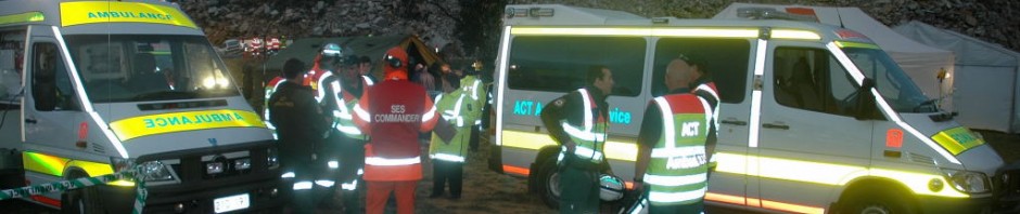
Yet again the use of operational police vehicles as “community policing high-visibility billboards” has compromised the vehicle marking schemes. A  successful marking scheme should enhance conspicuity and effectively transmit visual information to other drivers instead of making the vehicle more difficult to see and avoid by simply covering it in graphic public relations camouflage. Rapid recognition is one of the major critical elements that must be engineered onto the vehicle when placing markings on patrol cars, especially cars that are likely to be involved in emergent response or pursuits.
The photo above shows a mid-green Highway Patrol car with the vehicle body shape disguised and lost amongst irregular blue and white hybrid chequers fitted all round, a fluorescent sill stripe, a massively oversized force logo, a thin fluorescent yellow stripe on the rear, fluorescent keylined pink and white text above with larger white text keylined with black located below it and finally a pictorial graphic covering the entire rear window area. No less than eight different major colours and elements. Understandably the bonnet and front surfaces are clear of markings so the police vehicle can remain somewhat incognito when following another car. The choice of darker low-viz body colours like black, blue and grey just make the whole effect even worse. So when Joe Citizen has a collision with the patrol car, either running into it from behind or from one side, the police officer will be absolutely incredulous when Joe tells him he did not see the police car! Have a look at the image above and the video below and attempt to visualise where the bodywork starts and ends on the highway cars….then imagine trying that on a vehicle moving rapidly in traffic.
Compare these cars with the Porsche in the previous post! Just imagine the Porsche Panamara with a minimised area of blue checks – how much easier it is to visualise the entire vehicle quickly thanks to the white body and the single panel of fluorescent colour. By comparison the long weekend patrol cars are a messy hodge-podge of billboard design and uncoordinated graphics. High-visibility community policing aims should not be advertised on the side of a vehicle – but effective, well-designed high-visibility markings can be seen and recognised quickly, making it safer to work inside or around it at traffic stops on the roadside. Perhaps NSW Police could consider and think about this before next year’s long weekend traffic blitz. They could also read this article on markings or this one on advertising and visibility written for the EMSAC Star.


