I have a suggestion – go to Google images and type in pediatric ambulance (not paediatric ambulance for those of us outside the US that are using ‘proper English’). Look at the images; you can count on one hand the number of ambulances on the page with high-conspicuity fluorescent markings.

A paediatric ambulance displaying mural markings
Why then are so many hospital and EMS agency ambulances for transporting children covered with decorative murals, photographic body-wraps or crayola drawings. Almost all paediatric ambulances equipped with lights & sirens are fully capable of responding under priority conditions. It seems the common guidelines about emergency vehicle visibility and conspicuity have been conveniently forgotten by medical administrators when it comes to transporting our most valued and cherished family members; neonates, babies and children.
I travelled to the United States in 2010 and while there I asked many people why it was so common to see mural markings on paediatric ambulances across the country. Wherever I went the answer was generally the same. The hospital or agency sponsoring the paediatric service usually paid for the vehicle and as such, controlled the way their public image was displayed on the side. There is no doubt that corporate or institutional sponsorship of expensive paediatric care is definitely of benefit to the community. Therefore, it was not unusual for the sponsoring body to insist on maximizing their sponsorship exposure and public awareness. This type of arrangement takes place all over the world, not just in the United States. Although researchers like Nadine Levick continue to campaign for safer standards in the building and fit-out of paediatric ambulances, it can be very difficult convincing PR savvy corporate board-members that patient & crew safety extends well beyond the interior layout and must also include superior signage and markings on the outside.

John Killeen with a NETS officer just after finalising the new fluorescent markings and text for NETS ambulances
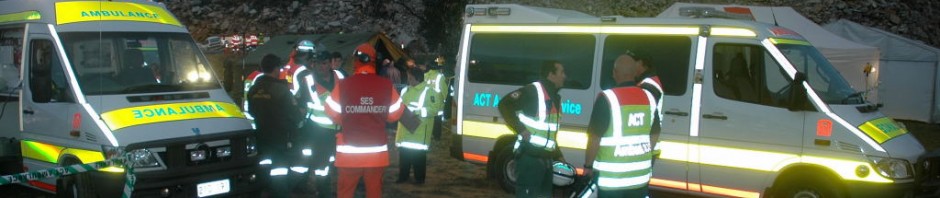
In 2007 I was asked to design high-conspicuity markings for an Australian neonatal and paediatric ambulance service. The new vehicle marking scheme had to incorporate adequate space for sponsors logos while the vehicle remained immediately recognisable as an ambulance. The Neonatal Emergency Transport Service of New South Wales (NETS NSW) had just achieved status as an ambulance agency in its own right and was expanding its role to include sick children of all ages. Fortunately, the NETS board- members were aware that visual safety for their vehicles, staff and patients was of paramount importance. It had already become clear to the NETS board that the former vehicle markings (which were almost identical to the NSW Ambulance Service design) were not being recognised by the public, nor were the NETS ambulances being given right-of-way during emergency response. The board was keen to follow the successful ACT, Queensland and Tasmania ambulance style of fluorescent markings while continuing to keep a fair promotional balance for their sponsors. A no-compromise fluorescent/reflective marking scheme with reflective white contour markings was easily adapted to the NETS ambulances, instantly providing a major increase in the level of conspicuity and safety.

Detail of the rear doors of a NETS ambulance showing sponsor logos
The balanced solution lay in allocating the sponsors several well-defined logo spaces on the sides and rear of the vehicle without visually undermining the fluorescent markings. Instead of large logos, the revised layout ensured that all the sponsor’s logos were located all around the vehicle so they were readily apparent to the viewing public, despite being somewhat smaller. Panels on both the front doors and one rear door were divided into three sections and each organisation allocated a space on each of the doors. When the issues about ambulance safety were carefully explained to the stakeholders, the final marking arrangement was accepted by everyone involved.
It was also determined that the NETS slogan “Moving intensive care for kids” was still effective; although if combined with references to neonatal terminology the intended message could become confused. The public needed guidance about the real functions of the NETS ambulances as they watched them travelling about. Ambulance Visibility recommended that the primary “kids” slogan be retained for public relations and a more definitive descriptor take its place on the vehicles. The wording “EMERGENCY INTENSIVE CARE for NEWBORNS and CHILDREN” was written along the roofline of the ambulance, thus fully emphasising the function and purpose of the vehicle to members of the public.
The results of the marking upgrade were immediate. The public profile of NETS was greatly enhanced as the public increasingly noticed the ambulances driving between hospitals across the state. In addition, the crews soon began to notice they were being given the right-of-way in traffic, even without the lights & siren activated. The NETS website describes how people now notice NETS Ambulances. In fact“….the staff have emphasized that the NETS Ambulances are now easily detected by motorists as they more promptly move to make space for the NETS ambulance to continue its vital life-saving journey.”

Video screenshot of a NETS ambulance with fluorescent markings as seen through a car windscreen in heavy rain
A short sequence within a promotional video created by the mining industry shows a NETS ambulance travelling on the roads in heavy rain. The camera was mounted inside another vehicle, looking through the windscreen. The clip clearly demonstrates the advantages of large fluorescent panels when the profile of the ambulance is obscured by the rain.
The NETS case study clearly demonstrates that substantial gains in conspicuity can be made on paediatric ambulances while retaining the continuing support of important sponsors. A well fitted display of fluorescent colours will attract more attention than a photographic collage or cartoon style body-wrap. The Australian experience shows that a reduction in the size of sponsor logos traded for increased exposure on three sides of the vehicle provides a safety solution that is just as acceptable to the ambulance sponsors, financiers and operators. A fluorescent marking scheme with smaller logos is often less expensive than a full vehicle body-wrap. The subsequent gains in safety for the crew, medical staff and the patient travelling inside a high conspicuity ambulance are substantial.
As always more information on the Ambulance Visibility website. Comments are welcome.


