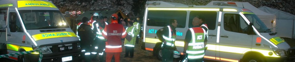
This is the second part of three articles written for the Colorado EMSAC Star. The first article in the series discussed the Ambulance Visibility ten-point toolkit for applying markings to emergency vehicles. This second article looks at advertising agency visibility, Battenburg markings and the ongoing chevron debate. The articles should be read alongside the presentation from the Colorado EMS Safety Summit 2010.
The first article is HERE
Read the full second article in PDF – CLICK HERE
EVALUATING NEW TRENDS IN EMERGENCY VEHICLE MARKINGS
Advertising agency visibility, Battenburg markings and the Chevron debate
Example 1 – The competitive markings of Law and Order: Each year the publishers of Law and Order magazine run a Police Vehicle Design Contest which is a great idea and possibly one that should be mirrored by EMS. The judging across fifteen different categories includes a People’s Choice award as well as the tongue-in-cheek “ugly-vehicle” prize. In 2011 the competition attracted 215 entries from police agencies across the United States. In the publishers favour they include a short list of recommendations for marking-up police vehicles.
Looking through the contest images it quickly becomes apparent that there is an almost total absence of fluorescent safety colours or contour markings on the competition vehicles. There are no high-conspicuity formats to be seen as most of the vehicles are painted either jet black, polar white or a combination of the two colors. The remaining vehicles are painted in palettes of the standard dealer colors. While I have no difficulty with police agencies choosing a color that maximizes return at the end-of-lease sale further thought should always be extended to the important issue of visual safety for their personnel working under operational conditions. In most cases these less-than-effective police vehicle markings are ill-conceived after having been applied to the fleet after consulting with a sign-writing firm or an advertising agency…
To continue reading the article CLICK HERE


Hey,
I’m a grade 12 student in Colorado with my father being a law-enforcement official. Over the past couple of years I’ve developed a huge interest in emergency vehicle liveries and lighting. I’ve fallen in love with the battenburg concepts (like standardized colors) and given my family connection, I’ve been studying how to combine the design-centered (yet still mainly ugly) US mindset on police cars with modern high-visibility studies in hopes of creating a modern livery for my local sheriff’s office. Part of my high school graduation curriculum is developing a large research/argumentative paper, and I’m doing mine on establishing stricter progressive standards for emergency vehicles on a national scale. I’m ecstatic to see the comprehensive research you’ve applied to your ACT vehicles and how you really seem to be passionate about effective high-visibility designs.
Over the past couple of years I’ve definitely noticed more agencies cherry-picking European concepts without applying them in a remotely appropriate way, and I’m really hoping not to make that mistake with my concept designs.
With that said, could I ask what your stance on whether or not chevrons should be used? I read so many of your articles where you point out that there is no legitimate evidence that chevrons are more beneficial than other markings, but I can’t tell if, given a choice, you would pick chevrons over simple striping. I was always under the impression that chevrons offered a clear indication of a stopped emergency vehicle (as in being able to identify its lack of motion from your reference point), but I’m guessing I’m mistaken. In my city, chevrons have appeared over the last year or two on fire and EMS vehicles while the local police department has opted to revert to a new black and white design (from their legacy design of just white), and it absolutely zero reflective materials (and quite honestly looks pretty bad).
Anyways, I love the information you have posted here. I just find purpose-based design to be absolutely fascinating, and your sites definitely offer hours of intriguing insight. I’ve had a key passion for graphic design for about five years, and remain mostly self-taught. I personally think a vast majority of police vehicle designs in the US are mediocre at best, and I’d really love to be able to set a new, reasonable precedent. If you’d ever be willing to look over my concepts, I would be absolutely honored for your insight. There’s an increasing chance I’d be able to push something through within the next eight years or so, and I can’t think of anything more exciting than being able to apply legitimate high-vis concepts to a culturally accepted livery.
Thanks for all the research you’ve done, I genuinely love it so much.
LikeLike