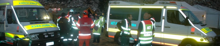

Upright chevron V markings on a Pikesville FD vehicle
In late November 2010, I received a blog comment from Capt. John Berryman from Pikesville Fire Department asking the following question about using upright chevrons on the rear of fire appliances rather than the inverted-V pattern. John also forwarded a photo of a Pikesville fire truck.
“Sirs, could you please reference any problems with using a standard V pattern for the reflective chevron markings on the rear. Not the inverted V pattern. Our department has installed a V pattern on the rear of one of our larger trucks and have come under question as to why. Somewhere a while back I read that the standard V pattern draws you attention to the standing vehicle much better then an inverted V pattern. Can you explain. Thanking you in advance.”
Thanks John – Here is a copy of my reply:
Background to chevrons Your question about upright V vs inverted V rear facing chevrons is not an easy one to answer. The earliest wide scale use of a large standardised chevron pattern took place in the UK when the Police forces placed them on vehicles in an attempt to reduce the incidence of rear-end collisions when police cars were stopped on motorways. This early chevron was a precursor to the Battenburg conspicuity marking designed a few years later. Up to this point most emergency agencies around the world had been using a narrow chevron band, diagonal striped band or small diagonal panels on the rear of their vehicles. In an attempt to reduce the rear-end collisions during the early nineties, UK police began placing a red and white striped chevron across the trunk lid of their sedan vehicles. They simply borrowed the chevron pattern from the usual roadside signs found in Britain and this also accounts for the current inverted orientation.
I have undertaken a considerable amount of research in an attempt to find a methodology as to why chevrons are oriented the way they are? It is clear that chevrons originating in ancient heraldry can be oriented either way; as are chevrons used in military insignia. Most road signs use an inverted chevron or horizontal chevron shape as an indicator arrow pointing towards the required direction of travel. The only definitive document I have found with any explanation about this is the Guide to Hazard Markers and published by Queensland Main Roads (Australia). This document outlines the rationale for particular chevron directions but it does not include an upright chevron pattern within the definitions.
Adoption of chevrons for the UK Police Battenburg conspicuity design. As a consequence of a need for enhanced high-conspicuity vehicles on the motorway and high-visibility policing off the motorway, the following operational requirement was formulated and developed by the UK Home Office; “To determine for police traffic patrol vehicles operating in a motorway environment a suitable common standard of markings which enhances, at a distance, conspicuity and recognition as a police vehicle.” Cutting a long story short – the Battenburg conspicuity pattern was developed for police sedans in the mid to late nineties. It made use of the new fluorescent retro-reflective materials that had just become available at the time. The Battenburg design came in two types:
1. Full Battenburg – for use on sedans for motorways 2. Half Battenburg – designed for use on sedans off-motorways in towns and on lesser roads. The development team acknowledged that the Full Battenburg pattern could exhibit camouflage effects when seen against the complex backgrounds found in towns away from the simpler motorway landscape.
The operational testing of Battenburg concentrated on the identification of the chequered blue/yellow side profile rather than the anti-collision chevron red/orange profile marked on the rear. In fact no independent testing of the chevron layout after separating it away from the Battenburg chequered vehicle design was ever undertaken. The development team simply borrowed the red/white inverted-V chevron pattern from the earlier police vehicles and combined it with the Battenburg trunk-mounted chevrons which were then altered to the new fluorescent colours. It was taken for granted that the new chevrons would reduce the rear-end collisions with police cars; collisions that had in fact been increasing during the previous years. The inverted-V orientation of the chevron was now formalised for the first time into the UK Police Battenburg design specification.
Research into Police vehicle rear-end collisions There are almost no publicly available figures issued by UK police that allow interpretation of the success or failure of chevrons in reducing rear end collisions. Only one group of researchers were given access to police statistics and they subsequently published the report An analysis of `Looked but failed to see accidents involving parked police vehicles’ This study by Langham, Hole, Edwards & ONeill examined police vehicles and the Looked But Failed To See phenomenon which led to the following conclusions:
On a theoretical level, the accident data clearly demonstrate that high levels of conspicuity (in sensory terms) do not guarantee detection of a vehicle, a conclusion supported by the results of our two experiments. They also suggest that cognitive factors, such as drivers’ expectations, may play an important role in causing this kind of `looked but failed to see’ accident. Precisely which cognitive factors are involved include fatigue, false hypotheses, inattention or a combination of all of these remains to be determined by future studies? On a practical level, the results suggest that drivers of all vehicles that are stationary on a high-speed road should try to draw attention to the fact that their vehicle is motionless: parking at an angle is one way to achieve this.
This research demonstrated that the use of rear chevrons does not guarantee a reduction in rear-end collisions. During the testing simulations one test driver had actually collided with the rear of the simulated police vehicle fitted with red/yellow chevrons.
The Battenburg markings were then borrowed by other UK emergency services. The Ambulance Services in the UK translated the yellow/blue Battenburg pattern into a new green/yellow combination and added a full sized chevron panel to the rear of their ambulances. This is the point in time that the UK layout would later go on to popularise the chevron pattern on ambulances and fire trucks in overseas countries. Remember, no research had yet concluded that the chevron design reduced rear end accidents!
The Battenburg testing had taken place on sedans and not full sized truck modules. Initially the UK NHS ambulance services experimented with a four axis chevron (four distinct chevrons pointing to the centre) but this was soon changed to the inverted-V. The inverted-V chevron has now become the standard orientation by default and is based on the UK Battenburg designs. This design logic relates back to the direction of the descending arms on chevron road signs indicating that the required direction of travel is to the side and away from the sign. This format is based on a top-down scanning pattern used by most people when looking at a sign, whereas the upright-V pattern would require a bottom-up scanning pathway . Other UK emergency services picked up the Battenburg + chevron pattern and began using the markings across many different exotic combinations of low-vis colours. The only true Hi-Vis colour scheme for Battenburg is the police yellow and blue and for chevrons red/orange with yellow.
The chevron pattern overseas During the early 2000’s the popularity of the UK Battenburg and chevron patterns migrated to overseas countries. This rapid increase in the use of the design on emergency vehicles was in part due to:
- Emergency agency personnel overseas finding the pattern distinctly different and therefore attractive.
- Graphics companies beginning to pick-up the Battenburg design and dramatically modify the original UK Battenburg design (including the chevrons) in both size and colour.
- A perceived safety factor that (unknown to most people) was as yet unproven
- Promotion of the modified Battenburg schemes by overseas manufacturers on their new safety concept vehicles.
- Finally – the adoption in the US of the chevron markings in NFPA 1901 as the recommended safety pattern for fire appliances.
This has led to “chevron creep” onto ambulances and other emergency vehicles in the US, including the borrowing of the standard UK yellow/blue police colours to represent other emergency agencies (especially EMS). The draft NFPA specification 1917 for ambulances now threatens to secure and formalise the Inverted-V chevron as the recommended baseline marking for all ambulances in the United States.
By default, the Inverted-V orientation will remain the international standard. As I explained earlier the only logic available for the Inverted-V appear to be the top-down scanning pattern and the independent definitions provided by the Queensland Roads document. There is now an official and public expectation secured by several formal US and UK specifications that chevrons will be fitted:
- As an inverted-V
- Use only reflective and/or fluorescent red/orange or yellow.
- Chevrons at least 6″ (150mm) wide.
- Be fitted to the rear of an emergency vehicle
I hope this summary provides some information about what has happened to the chevron pattern over the last few years. Unfortunately it appears that little support will be available for the upright-V chevron pattern as public opinion has quickly adopted the Inverted-V as the national standard. Not only will your agency vehicles be different to most others around the country but you will continue to receive criticism for not following the national guidelines, which although not mandatory, still carry substantial weight in both the industry and public arenas.
As stated throughout this summary, there appears to be very little concrete evidence confirming the design rationale or efficacy of chevrons in any orientation, but the pattern appears to have secured a formal position due to a perceived element of safety and through popular industry opinion. There is very little research available to assist you in making a decision concerning the alternate chevron design currently on your vehicles. Also, have a look at the 3rd Annual Colorado Safety Summit presentation available in the downloads section on the AV website at http://www.ambulancevisibility.com …. the PowerPoint illustrates many of the details I have discussed.


I just posted a Battenburg/visibility article about our companies in Connecticut. Please take a look at the post and provide a comment as you see fit. I will be checking back with your blog regularly. Our company blog is asm-aetna.com/blog.
LikeLike
Dave, Thank you for your interest in the AV Blog and also for posting your comment. Aetna is to be commended for changing away from the Sillitoe checker pattern to the Full Battenburg markings.
The smaller blck Sillitoe markings are being removed from emergency vehicles in Australia and other countries as organisations realise they do in fact camouflage the vehicle. I can also understand your choice of fluorescent orange for your Battenburg colour scheme as your vehicles work in snow conditions for much of the year. Your crews will still need to exercise care under conditions of low ambient light (eg street-lighting) as the panels of the orange/blue combination are percieved by an observer as dark colours (the orange and blue are very similar in terms of luminance). However this is not the case when the light from a headlamp illuminates the orange/blue pattern – the much higher retro-reflective capacity of the orange panels compensate by reflecting significantly more light than the blue panels.
The fluorescent yellow/green colour used on the original UK police battenburg scheme possesses a much higher ambient and retro-reflective luminance value than the flourescent orange. The yellow/green Battenburg combination still remains the only fully tested high-conspicuity colour combination. The posts on the AV blog and the information available on the Ambulance Visibility website explain many of the Battenburg pros & cons in more detail. A substantial part of this information from AV is referenced in the FEMA Conspicuity report
I would like the opportunity to highlight your blog post on the AV blog as a good example of ongoing research being used to upgrade vehicle markings if that is OK with you. Again, well done to Aetna for moving forward.
LikeLike